A journey through the creation of the new headquarters of L - founders of loyalty
Transforming a former KPN telephone building into the new headquarters for L - founders of loyalty represents our most comprehensive assignment to date. Our mission was clear: 'Creating the most beautiful and pleasant office in the Netherlands.' An office with a sustainable future, eight floors each with its own character, a beautifully renovated facade, a welcoming entrance, and where inspiring each other takes center stage. Over three years, we guided this project from demolition to styling, and the result speaks for itself!
Explore on this page the development and final result of the exterior, the linkway and all eight floors!

From KPN telephone building
to L - founders of loyalty HQ
The old KPN building in Den Bosch had to be transformed into L- founders' new headquarters, with the assignment: 'Creating the most beautiful and pleasant office in the Netherlands.' A place where fostering gatherings and inspiring creativity were fundamental requirements for the driven teams at Loyalty, who are responsible for developing innovative concepts, ideas, technologies, and products for retail organizations worldwide.
The building, originally constructed in the 1950s as a telephone exchange, features dark red brick, numerous corridors, visually dominant and closed off entrance, and limited transparency. A stark contrast with the vision of a marketing company like L - founders of loyalty, which is characterized by visibility and transparency. It was our task to restore the building in a contemporary way and connect the two existing building forms, with different floor heights and number of floors, with each other.
Exterior
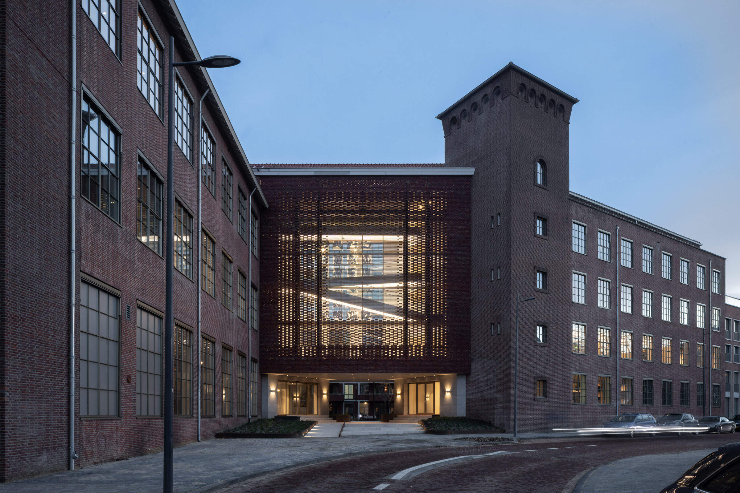
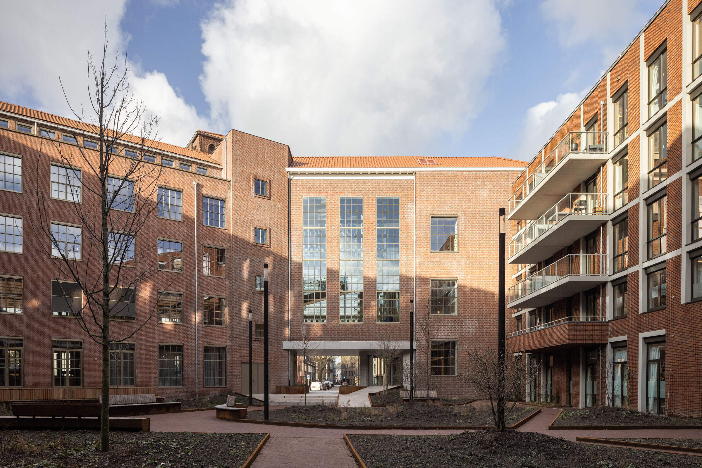
Both the demand for transparency and the need to create a welcoming entrance for L - founders, as well as the desire to open up the urban courtyard behind the Amadeiro apartment complex on the city center side, called for a new approach to this closed brick linkway.
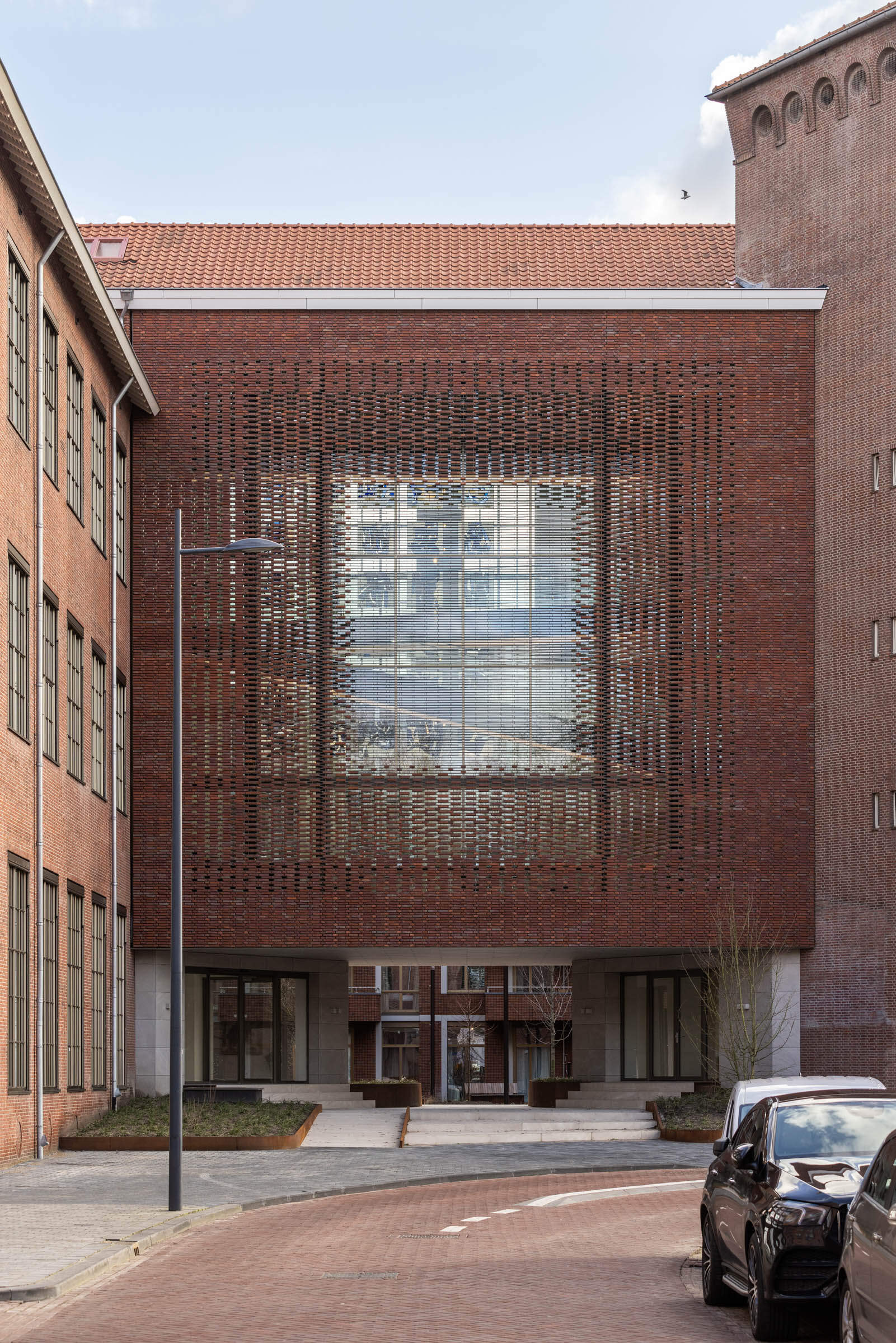
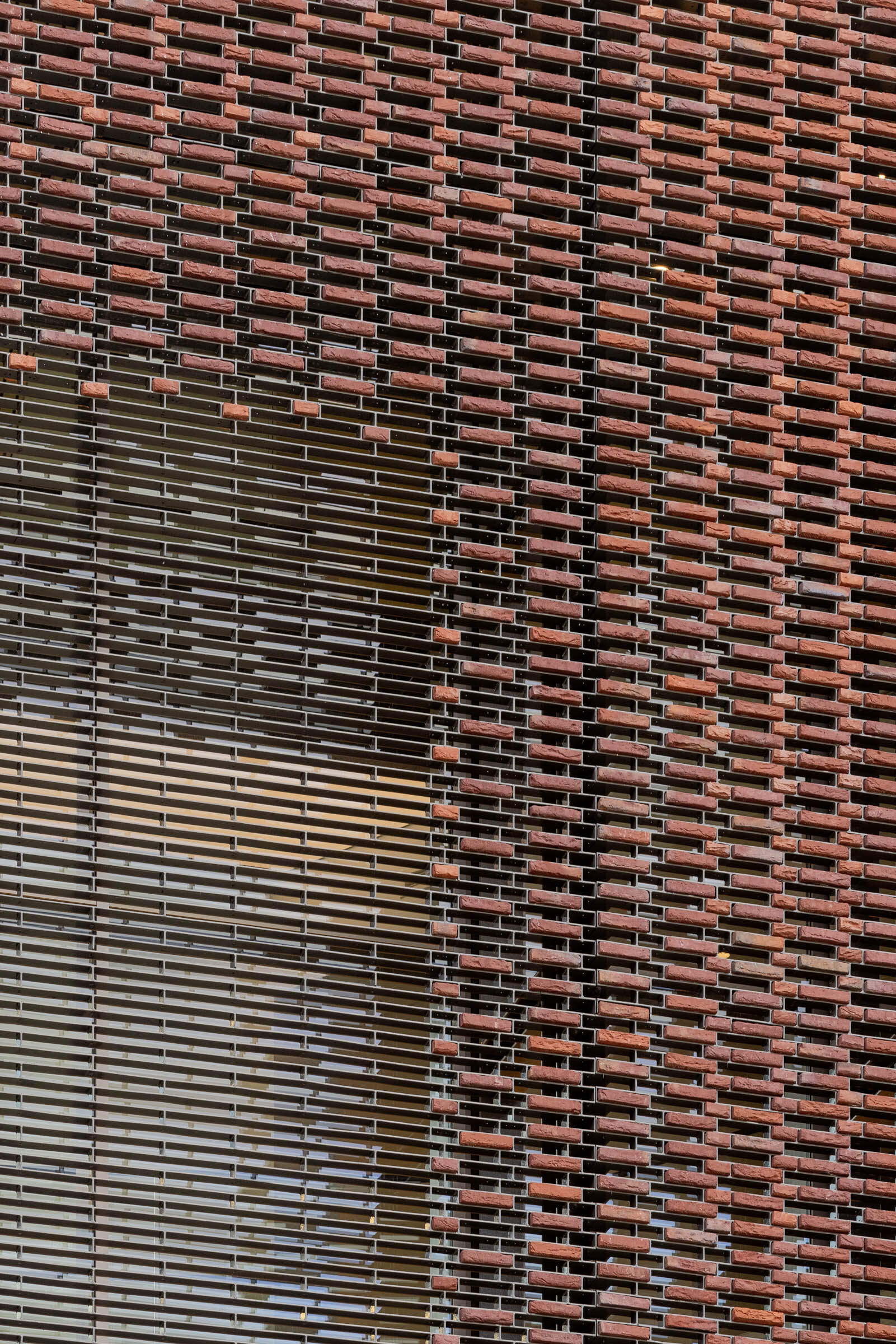
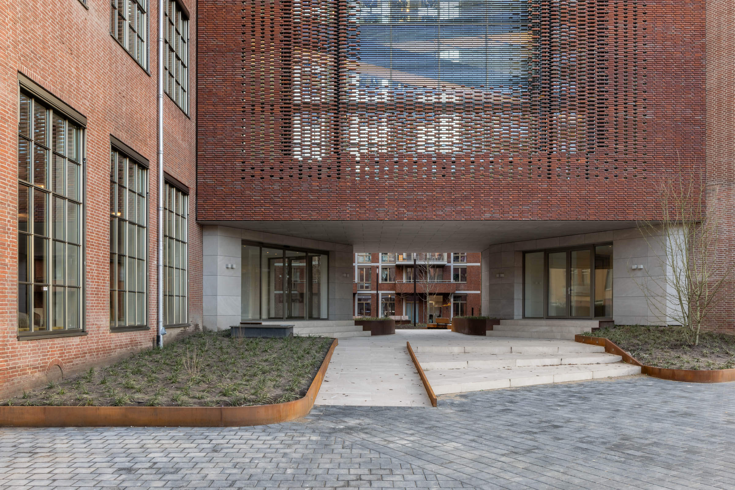
The new linkway connects both inside and outside the two existing brick buildings. We used the layout of the old facade to design a transparent masonry facade, inspired by the Brazilian open masonry bond. We replaced the closed mortar joints with a steel frame with bricks glued in it. Toward the center, we gradually removed more bricks. This way, we could add more transparency both inside and outside.


The linkway & stained glass
A semitransparent connection that binds two buildings into one.
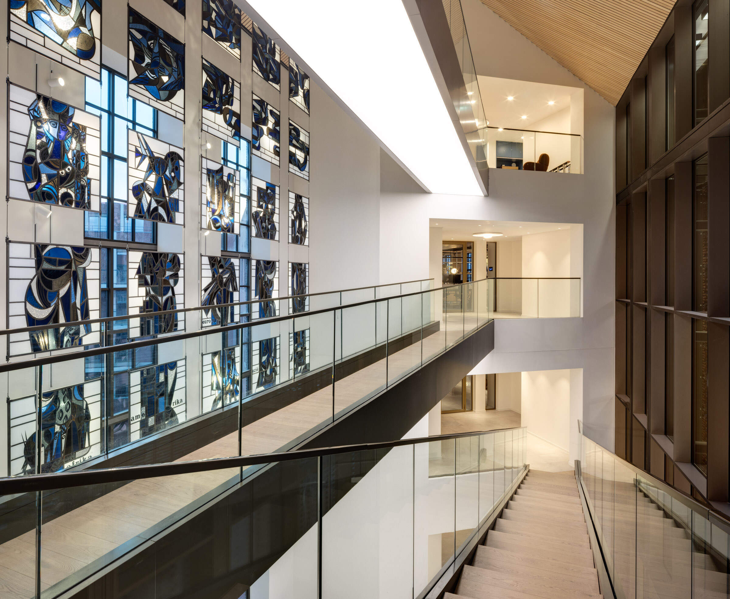
The new linkway serves to connect not only the two remaining buildings but also multiple floors. Due to the differing floor levels of the two buildings, creative measures were necessary on each floor to overcome the height disparity. Sloped bridges within the interior of the linkway connect the different floor heights of each building. In order to achieve the desired transparency within the linkway, the bridges incorporated glass balustrading and illuminated walkways.
We also incorporated two main stairwells with elevators near the new linkway and added two emergency stairs at either end of the existing building forms, to help with the vertical connection of the two buildings.
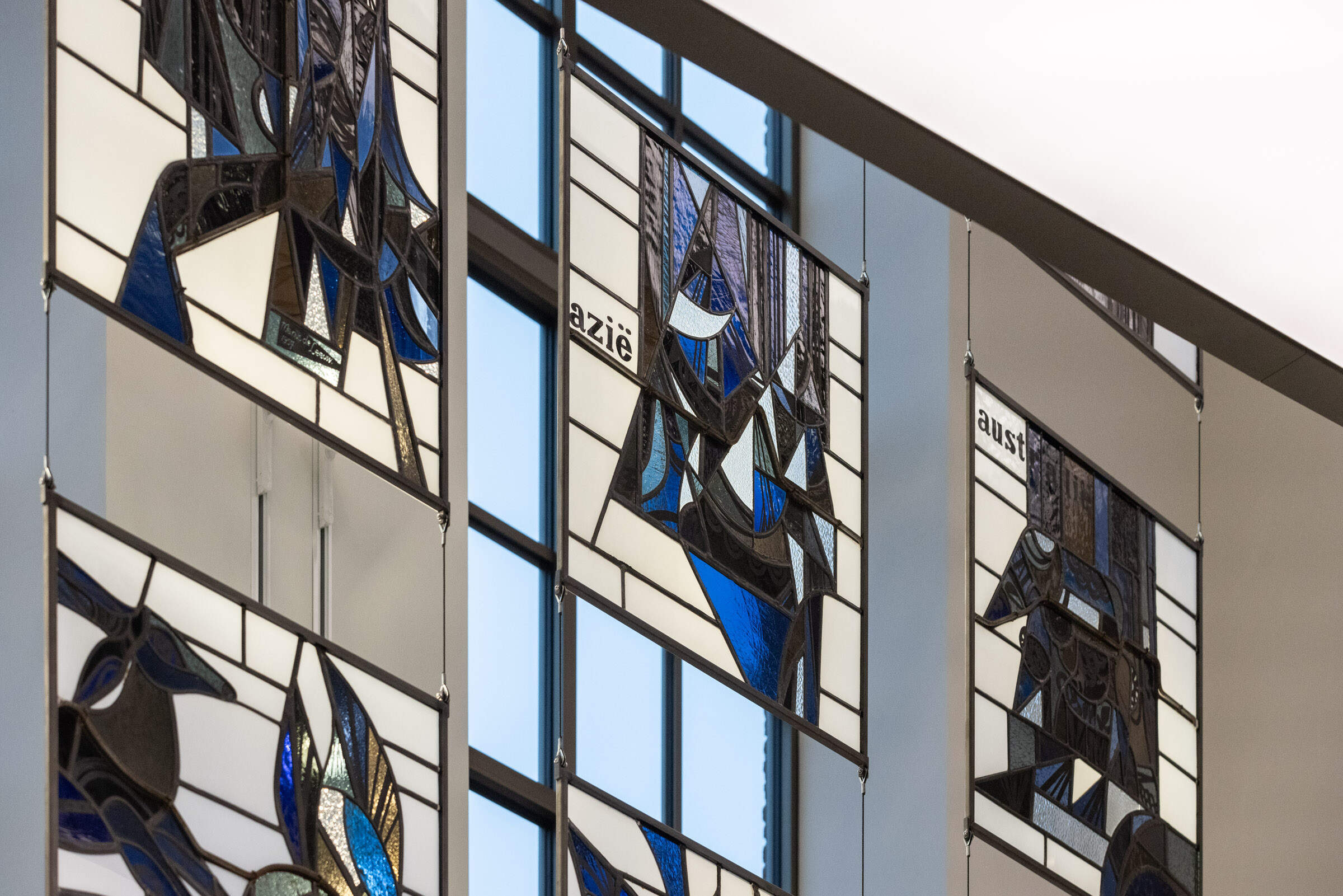
The stained glass artwork from the old facade still has a prominent place in the interior. We managed to remove the artwork from the facade and later hung it back in its entirety and restored it in the open space of the interior. Thanks to sophisticated lighting, the artwork comes into its own not only during the day, but also in the evening, and gives color and warmth to the linkway.


Interior with
diverse
global atmospheres
The entire complex consists of 8 floors, one building consists of 3 floors and the other 5 floors in total. To create the desired level of hospitality and homely feeling, we gave each floor its own unique ‘vibe’. Taking Loyalty's international playing field as our starting point, we sought inspiration from various world cuisines. Latin passion, Californian wine, and Asian and Italian flavors quickly came to the fore. Later, more subdued themes such as American Industrial, Japanese serenity, and Dutch simplicity followed.
By primarily using natural materials, we were able to play with atmospheres that seamlessly blend into each other. For example, you will find furniture of the same design, but executed in different materials and colors. Or floors of the same wood type, but laid in a different pattern. In our designs, we generally opt for high-quality upholstery, fabrics, and furniture that you could also have at home. We believe that the user recognizes quality and therefore attaches more value to it.
Curious about these floors? View them below!
Click on the image for more information and photos per floor.
By lowering the existing basement ceiling, the two entrances and external passageway to the courtyard were given a sense of spaciousness and light. Both entrance doors are positioned in such a way that they structurally support the floor of the linkway above and, at the same time, appear symmetrical, despite the two building forms on either side being at different orientations. The gently sloping natural stone stairs and well-placed greenery complete the overall desired look.

Sustainability Today
The high ceilings, the openable single-glazed windows, and the thick exterior brick walls without insulation used to provide a reasonably pleasant, ventilated indoor climate, but also resulted in exorbitant heating costs, poor temperature control and humidity management. Nowadays, of course, we have different demands.
During the renovation, all exterior walls were fitted with insulation panels featuring high-quality insulation, and the uPVC window frames were replaced with insulated aluminum frames equipped with triple glazing (HR++). Heating and cooling of the spaces are facilitated through ventilation air (from the Heat Recovery Ventilation systems) and underfloor heating provided by a Ground Source Heat Pump system.
Each floor has a custom solution for the ducting of the ventilation and heating systems, tailored to the unique atmosphere. For instance, on the floor themed 'American Industrial,' we aimed to keep the ducts visible, whereas on the floor themed 'Japanese Serenity,' all amenities are discreetly concealed within the lighting elements on the ceiling.


