Metamorphosis of a 1970s bank building into a modern, welcoming headquarters
What was once an old bank building, we have transformed into the modern headquarters for Hobij. We tackled it from top to bottom: from basement to top floor, even adding a complete extension next to the old bank building. The transformation of an outdated bank building into a transparent, contemporary structure where hospitality takes center stage. A true metamorphosis down to the smallest details.

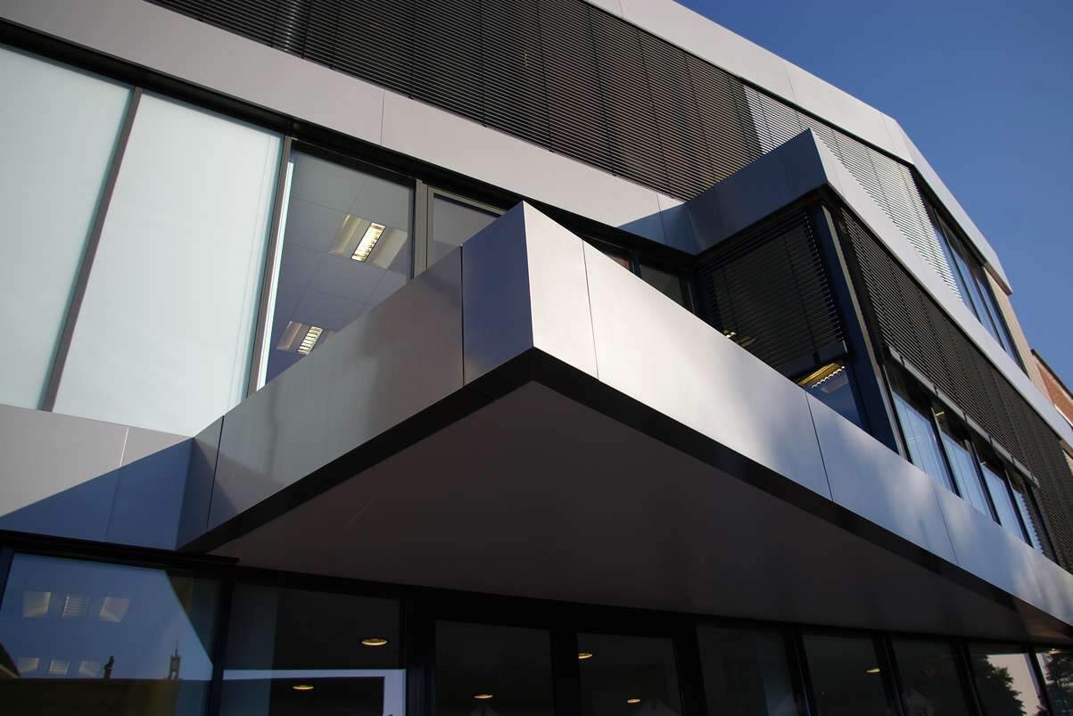
The existing building had a closed and harsh appearance due to its stone facade and unfriendly exterior staircase. In the redevelopment, the entire facade was removed and replaced with a mostly glass facade with clear lines.

The building is located exactly at the bend in the street wall where two streets meet. In the newly designed facade, the two directions meet. This allowed the new entrance canopy to be designed in line with the rest of the facade. The canopy and the relocated entrance staircase to the interior give the building an inviting appearance.
Due to the southern orientation, the front is equipped with automatic external sun blinds, which disappear completely into the metal facade strips when retracted!

"The biggest challenge was to create a modern, open office space within a dense concrete structure."
Roel Scheepmaker - Voss Architecture

From vault
to comfort
The basement of the building was built in the 1970s for the main vault: a heavy, concrete basement with no natural light. However, it now had to become a comfortable place to welcome clients.
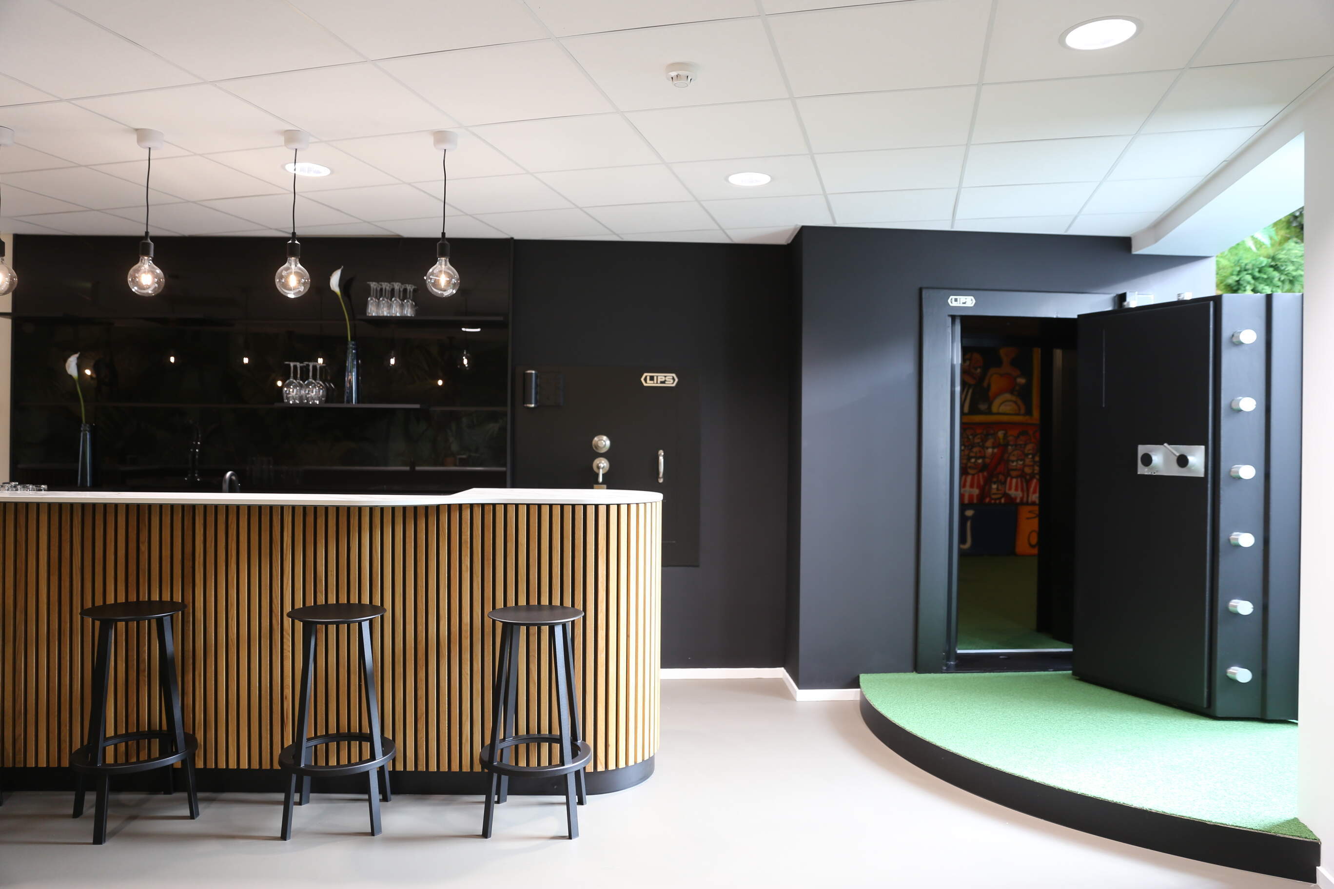
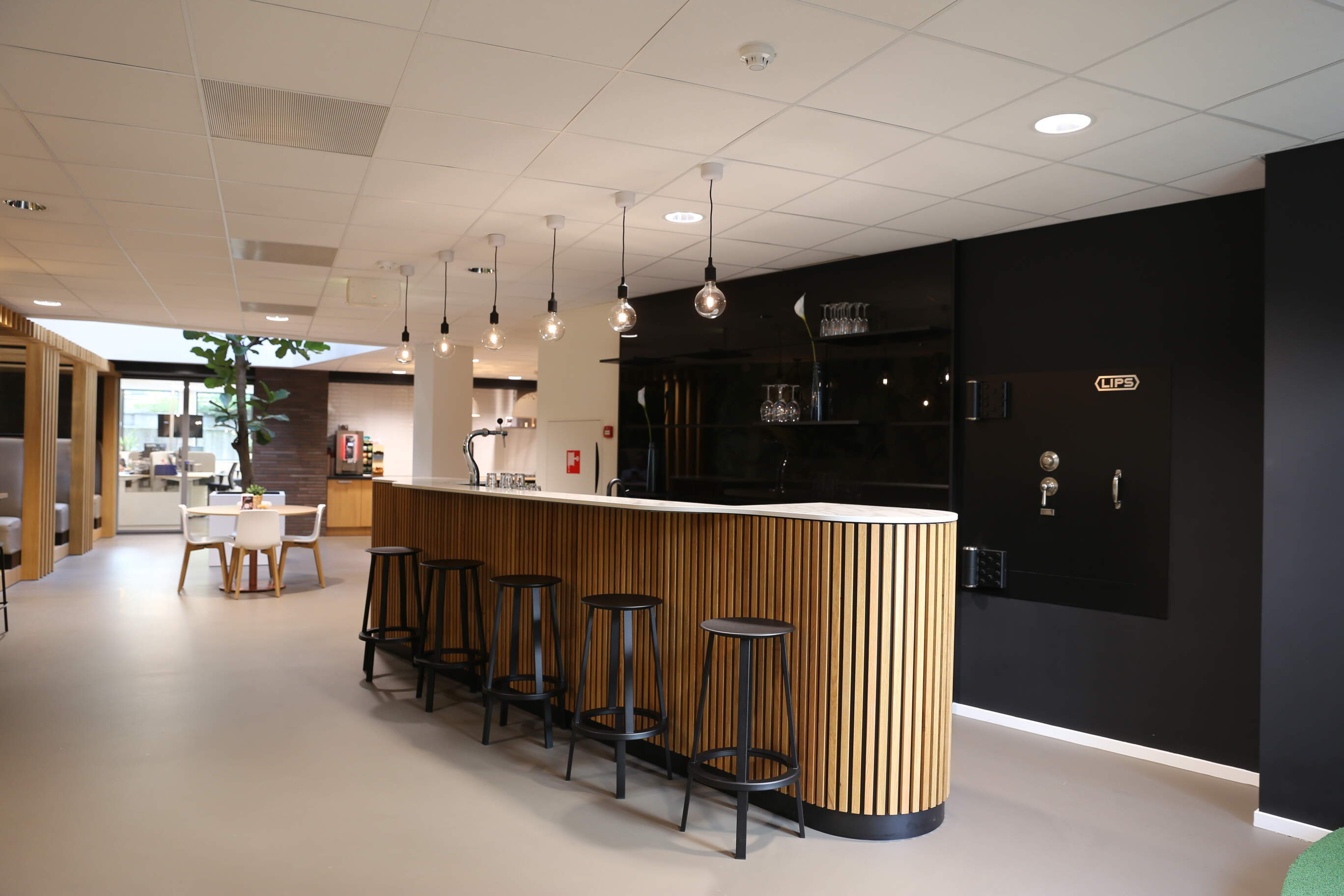
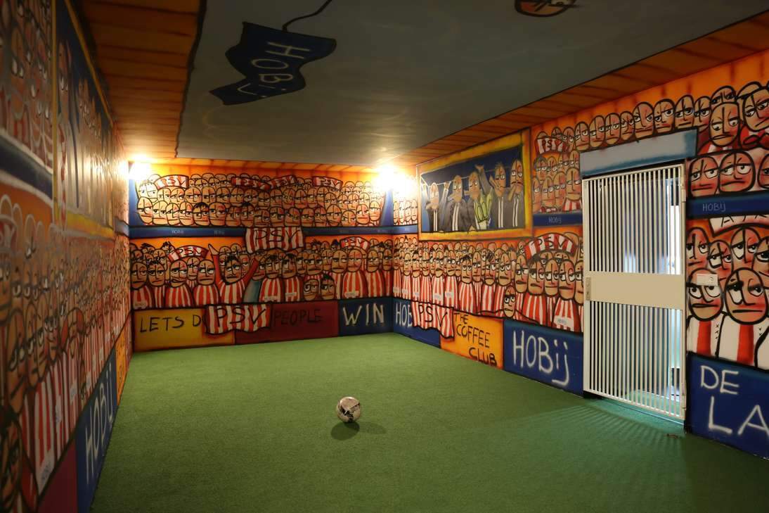
We brought light and air into the basement by creating two large openings in the ground floor and excavating and installing a glass rear facade. The existing bank vault with vault door was converted into a relaxation area, complete with a mini soccer field for recreation. Since Hobij's clients can sometimes stay on-site for a long time, this space is designed to make them feel welcome and comfortable for an entire day.

Transparency
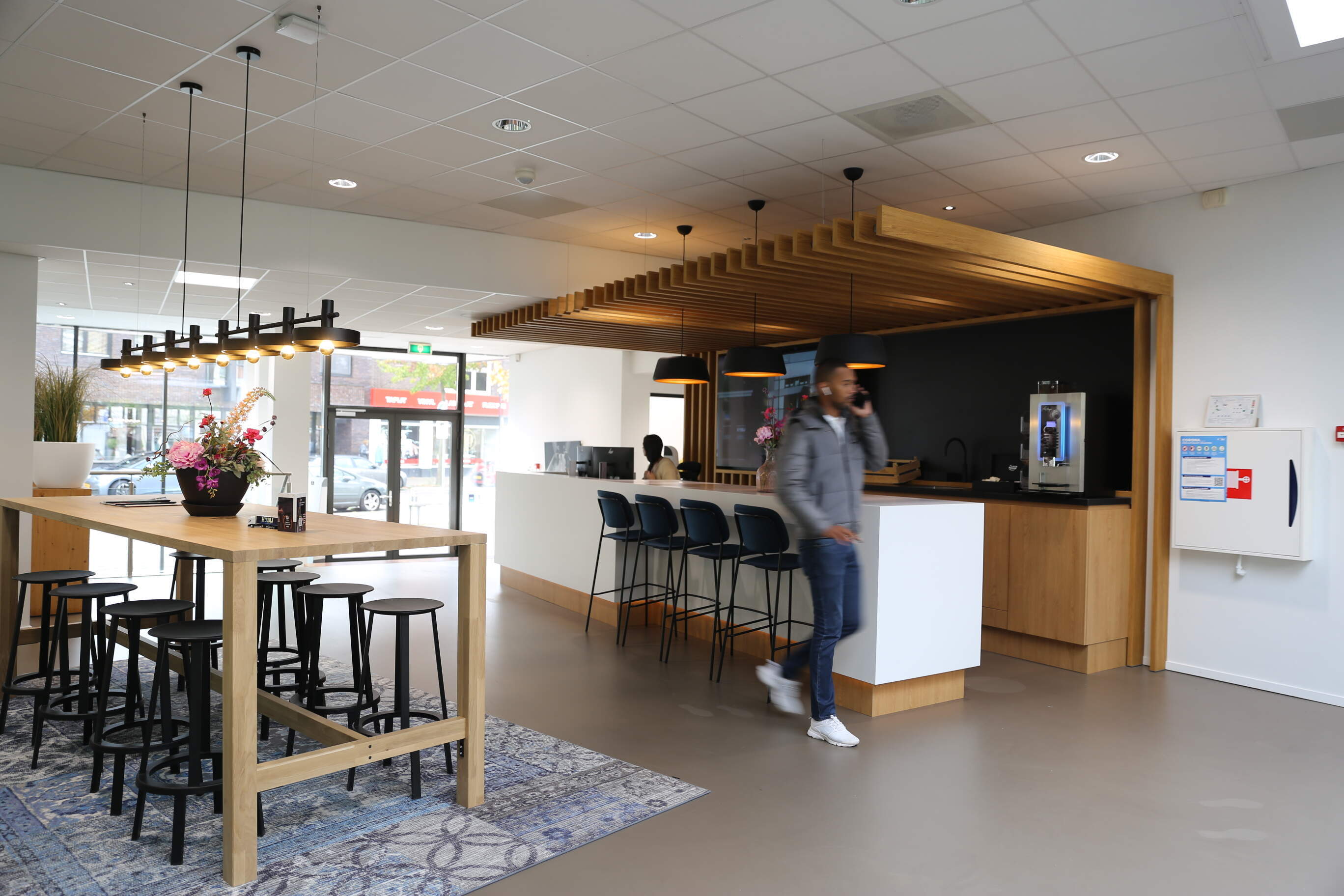
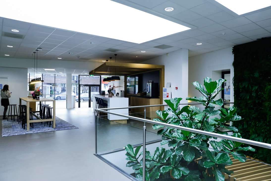
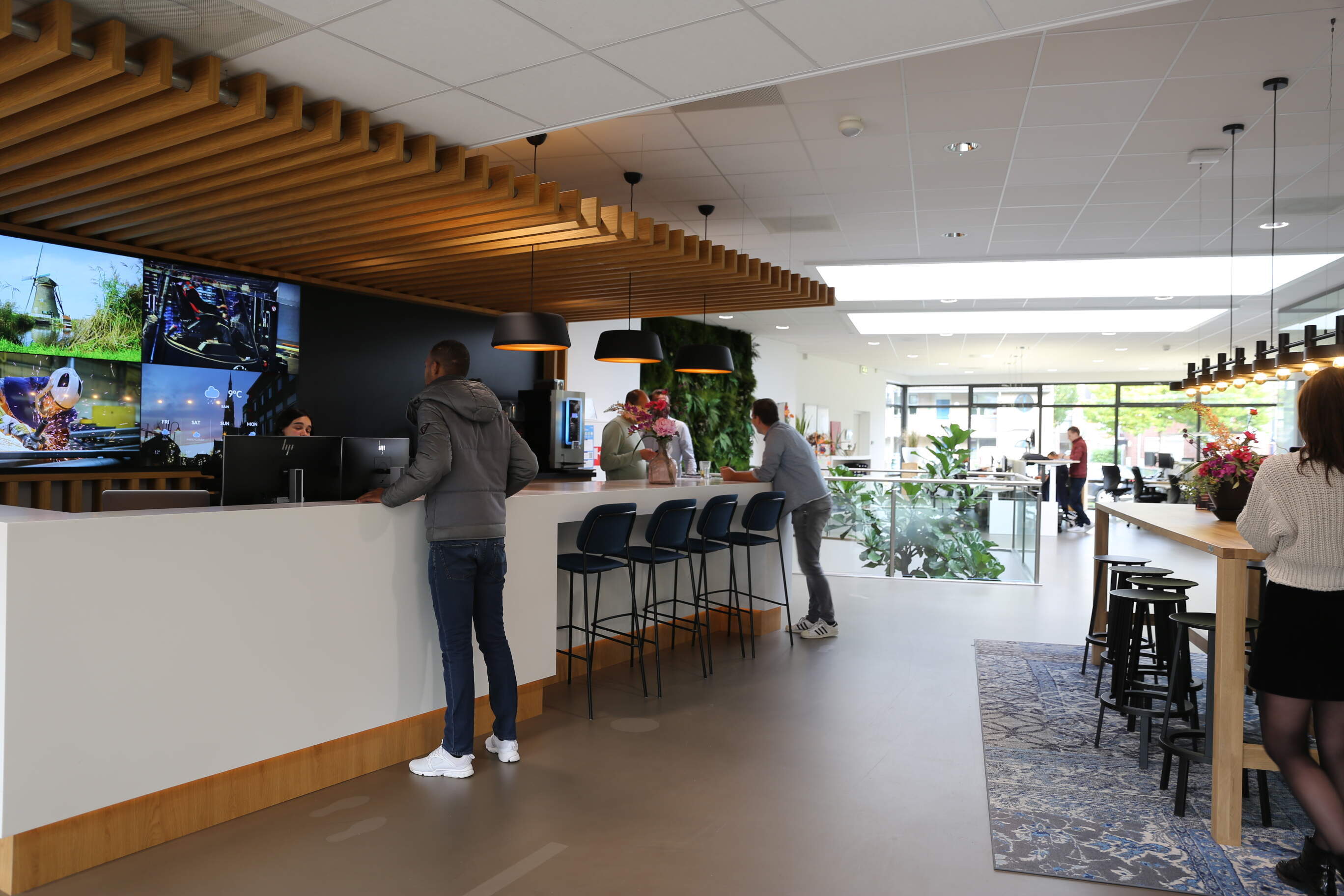
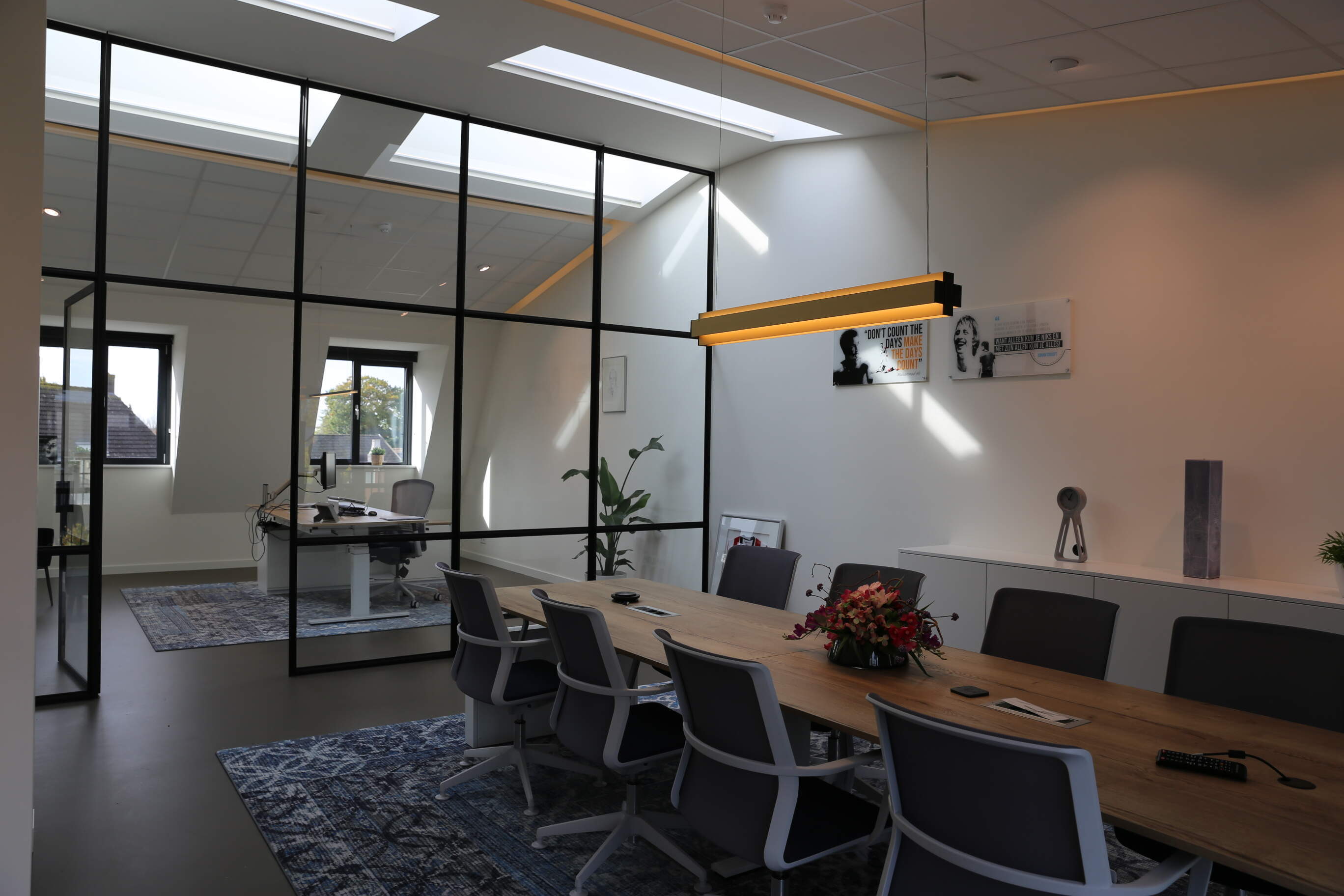
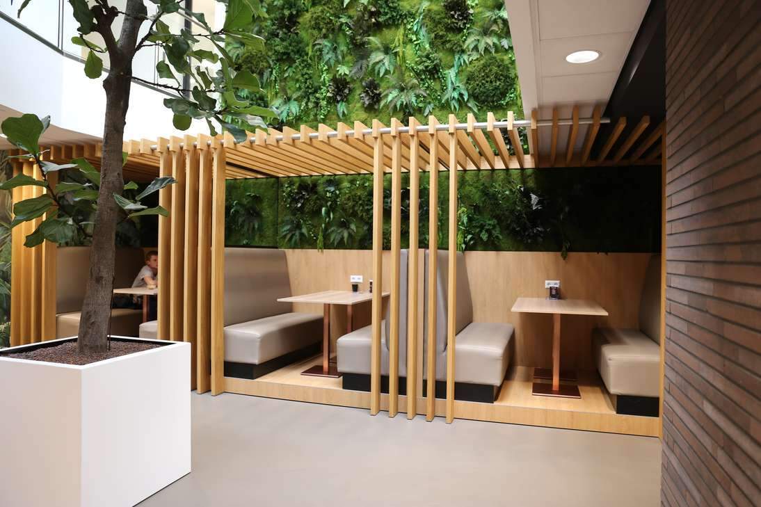
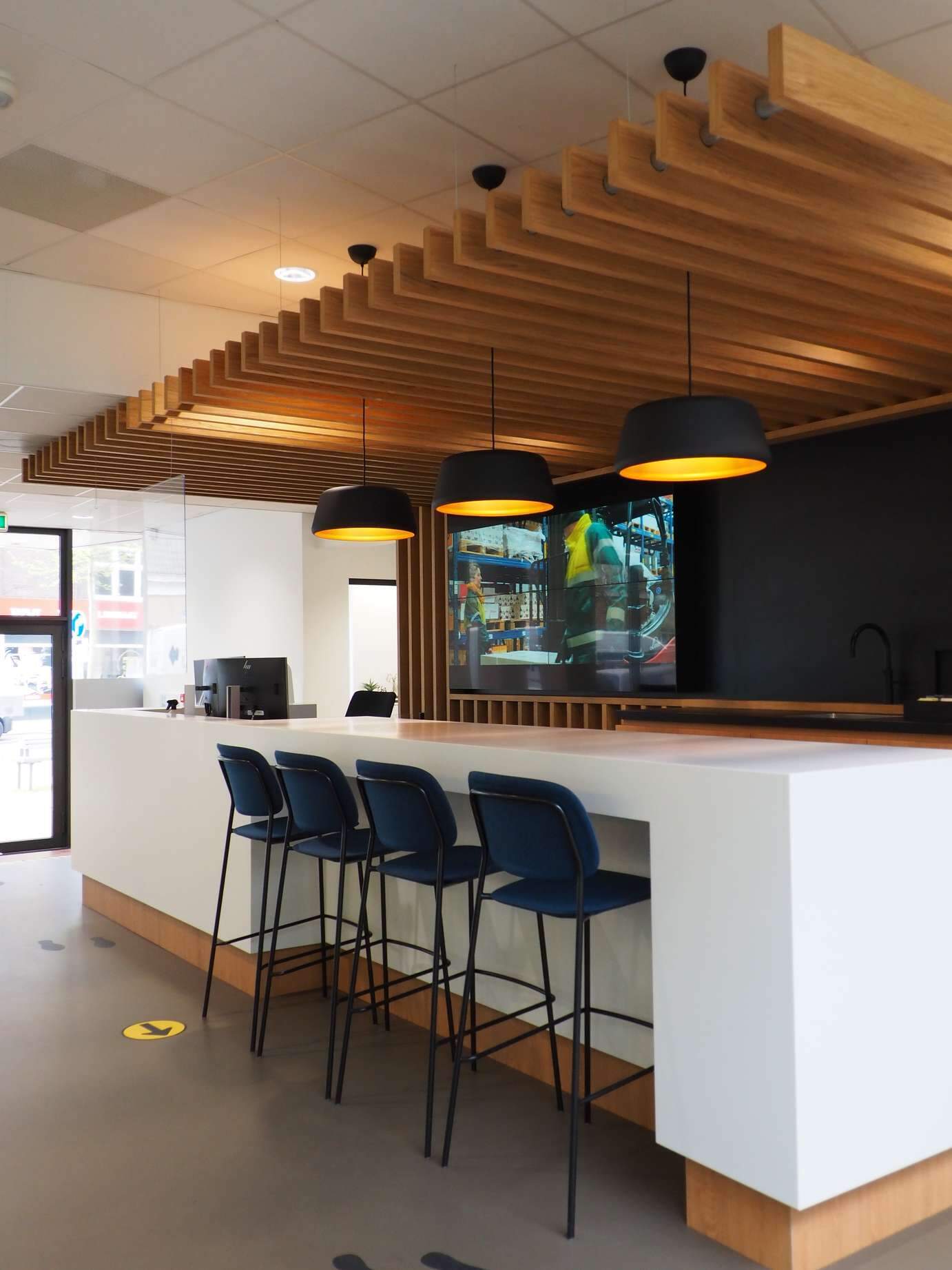
Upon entering, you immediately feel welcome at the reception desk designed by us, where hospitality once again takes center stage. The open office spaces are mainly located at the back and on the (upper) floors of the building. Here, transparency is a core aspect, with the use of glass partition walls instead of fixed solid walls.

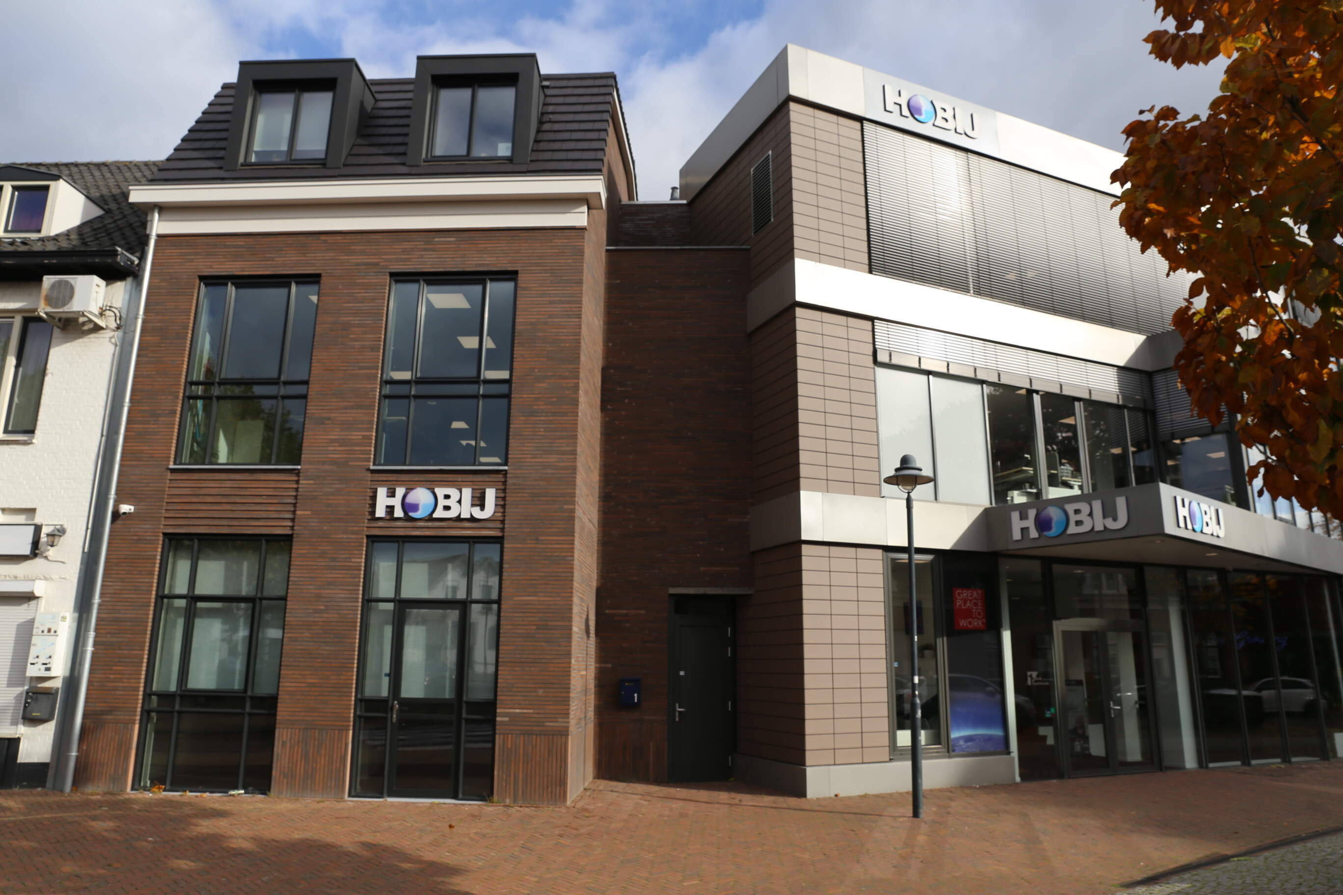
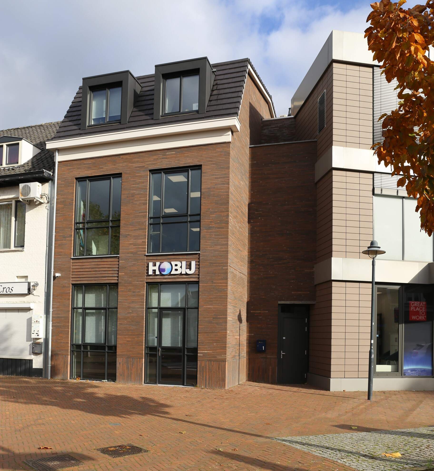
Several years later, the need for additional office space arose, and our client purchased the adjacent dilapidated house. On this narrow, deep plot of land, we added 3 office levels, connected via the existing staircase of the old bank building to the existing office. This allowed us to utilize the entire layout for the desired office spaces. According to the municipality's wishes, we harmoniously integrated the facade into the adjacent residential street. The dark, long concrete blocks, the various masonry patterns, and the slender aluminum frames give the facade a classically modern appearance.

More impressions:


